
Key Takeaways
- UX chips are interactive UI elements that enable filtering, selection, and content organization in compact, user-friendly formats
- Four main chip types exist: filter chips for content refinement, action chips for triggering actions, input chips for data entry, and choice chips for single selection
- Proper chip implementation requires clear visual states, consistent behavior patterns, and adherence to accessibility guidelines with 48x48dp minimum touch targets
- Chips offer superior space efficiency compared to traditional buttons and checkboxes while maintaining intuitive user interactions
- Material Design 3 provides comprehensive guidelines for chip anatomy, theming, and responsive behavior across different screen sizes
What Are UX Chips and Why They Matter
In today’s mobile-first digital landscape, every pixel counts. UX chips represent a revolutionary approach to creating compact elements that pack maximum functionality into minimal screen space. These interactive UI components serve as versatile tools for organizing information, enabling user actions, and streamlining complex interfaces without overwhelming users with visual clutter.
A chip is fundamentally different from static badges or tags. While badges simply display information and tags categorize content, chips are fully interactive elements that users can tap, select, filter, or manipulate. This distinction makes chips a powerful alternative to traditional buttons and checkboxes, especially when screen real estate is limited.
The primary value of chips lies in their ability to reduce cognitive load while maintaining functionality. According to usability research, users process interfaces with distinct chip components up to 30% faster than those using plain text lists or traditional controls. This performance improvement stems from the chunking principle – grouping related information helps users retain and process more items in working memory.
Modern design systems like Material Design have embraced chips as essential components for creating visually appealing and functional interfaces. They represent a good alternative to cluttered layouts filled with multiple buttons or endless dropdown menus. Instead of forcing users to navigate through complex menus, chips bring relevant actions and filters directly to the primary content area.
The evolution of chips reflects broader trends in UX design toward more intuitive, touch-friendly interfaces. As mobile usage continues to dominate digital interactions, chips provide an ideal solution for creating interfaces that work seamlessly across different screen sizes and input methods.
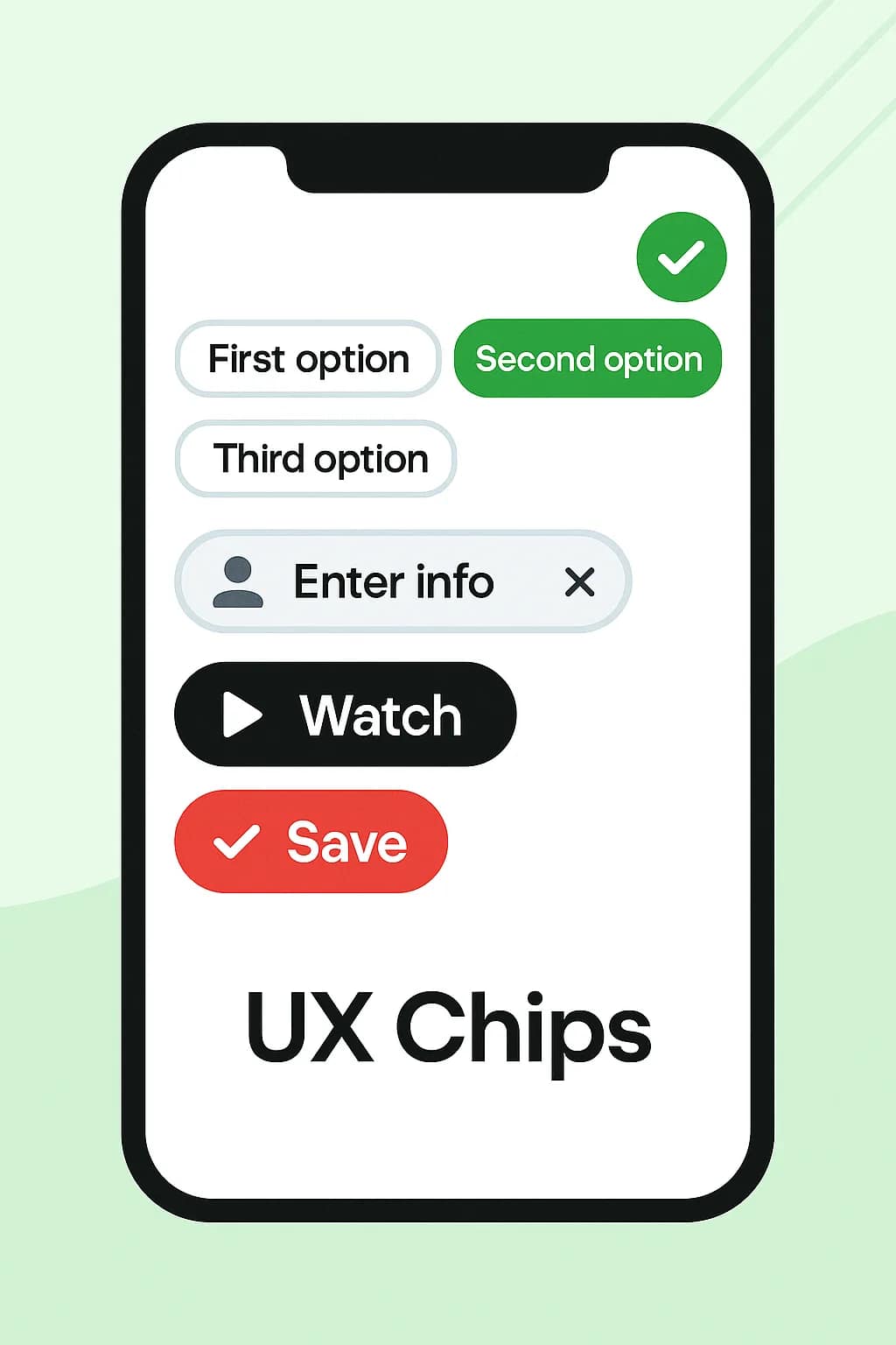
Types of UX Chips and Their Use Cases
Understanding the four types of chips is crucial for implementing them effectively in your projects. Each variant serves specific user needs and follows distinct interaction patterns that optimize the overall user experience.
Filter Chips
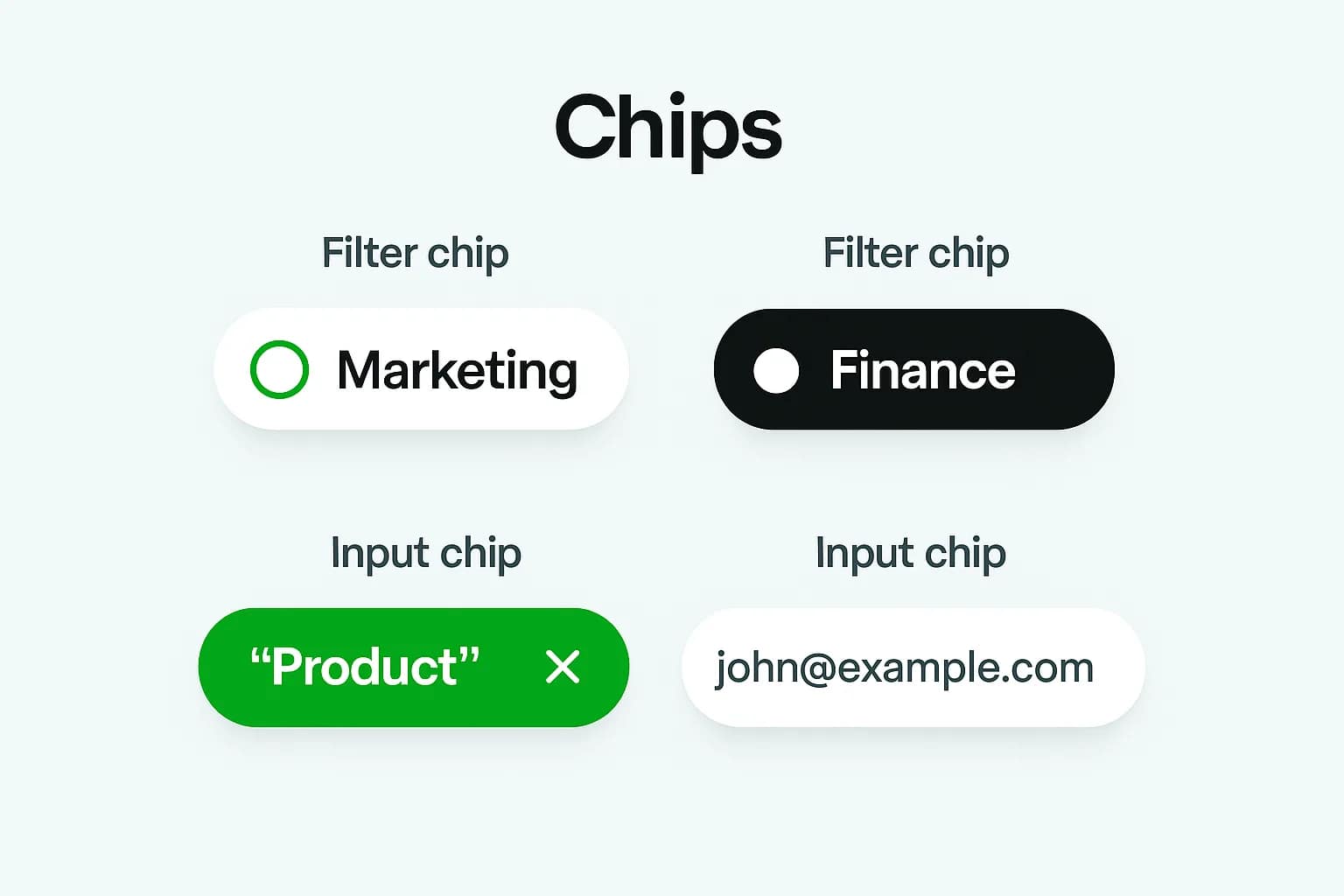
Filter chips enable users to refine content without leaving their current view. These interactive elements act as dynamic filters that help users narrow down large datasets or content collections. Unlike traditional dropdown menus, filter chips provide immediate visual feedback about active filters and allow users to quickly toggle multiple options.
The most effective filter chip implementations display both selected and unselected states clearly. Selected chips typically feature a different background color, border, or icon to indicate their active status. Multiple chips can be selected simultaneously, allowing users to combine filters for more precise results.
E-commerce platforms exemplify excellent filter chip usage. When browsing products, users can select multiple filter chips for brand, price range, size, and color. Each selected chip remains visible, helping users understand their current search parameters and easily remove unwanted filters by tapping the chip icon or close button.
Filter chips work particularly well when you need to display the current state of applied filters prominently. They eliminate confusion about which options are active and provide a clear path for users to modify their selections.
Action Chips
Action chips trigger specific actions related to the primary content on screen. These chips differ from persistent buttons because they appear contextually based on user behavior or content state. Action chips excel at providing quick shortcuts and suggestions that enhance user workflow.
Common examples include “Share,” “Download,” or “Add to favorites” chips that appear near relevant content. These chips often feature descriptive icons alongside text labels to communicate their functionality clearly. The key advantage of action chips over traditional buttons is their ability to appear and disappear based on context, keeping interfaces clean when actions aren’t needed.
Suggestion chips represent a specialized form of action chips that help users discover features or complete tasks more efficiently. These might appear as “Try searching for…” options below a search bar or as “Quick actions” in productivity apps.
The dynamic nature of action chips makes them particularly valuable for reducing interface clutter while maintaining functionality. Rather than displaying all possible actions constantly, action chips surface relevant options when users need them most.
Input Chips
Input chips assist users with data entry by transforming text input into structured, interactive elements. These chips are most commonly seen in email composition fields, where typing a contact name generates a chip containing the person’s information. This transformation makes it easier for users to verify, edit, or remove entries.
The power of input chips lies in their ability to provide immediate feedback and validation. When a user enters information, the system can validate the input and display it as a chip with appropriate visual indicators for valid or invalid data. This immediate feedback helps prevent errors and improves the overall user input experience.
Input chips often integrate with autocomplete functionality, suggesting relevant options as users type. Once selected, these suggestions become chips that users can easily manipulate. This pattern works exceptionally well for tag inputs, recipient selection, and category assignment.
Implementation considerations for input chips include handling both typed input and selection from suggestions. The component should gracefully handle various input methods while maintaining consistent visual presentation across different chip states.
Choice Chips
Choice chips enable single selection from multiple options, functioning similarly to radio buttons but with improved visual appeal and space efficiency. These chips work best when you need to present several mutually exclusive options in a compact, scannable format.
Unlike filter chips that allow multiple selections, choice chips maintain single-selection behavior throughout the user interaction. When a user selects one choice chip, any previously selected chip in the same group automatically deselects. This behavior should be consistent and predictable to avoid user confusion.
Choice chips are particularly effective for settings and preference screens where users need to select one option from several alternatives. They provide better visual hierarchy than traditional radio buttons while occupying less vertical space than button groups.
The visual design of choice chips should clearly indicate which option is currently selected while making unselected options obviously interactive. This balance helps users understand both the current state and available alternatives at a glance.
Design Guidelines and Best Practices
Successful chip implementation requires adherence to established design principles that ensure usability, accessibility, and visual consistency across your interface. These guidelines form the foundation for creating chips that enhance rather than complicate user interactions.
Visual Design Standards
The anatomy of a well-designed chip includes several critical elements that work together to create an effective user interface component. The container provides the visual boundary and interactive target, while the label communicates the chip’s purpose or content. Optional elements like icons and close buttons add functionality without overwhelming the basic structure.
Material Design 3 specifications provide detailed measurements for optimal chip implementation. The minimum touch target of 48x48dp ensures accessibility compliance across different devices and user needs. This standard accommodates users with varying motor abilities and prevents accidental activations on touch screens.
Spacing between chips requires careful consideration to maintain visual clarity without wasting screen space. The recommended 8dp spacing provides enough separation for individual chip recognition while allowing multiple chips to coexist in compact layouts. This spacing also prevents touch targets from overlapping, which could lead to user frustration.
Color contrast ratios must meet WCAG 2.1 AA standards to ensure accessibility for users with visual impairments. Selected chips should have sufficient contrast against both the background and unselected chips to communicate state changes effectively. Typography within chips should remain legible at all supported zoom levels.
Icon usage within chips should serve functional rather than purely decorative purposes. Icons help users quickly identify chip functionality, but they should not replace clear text labels. When space constraints require icon-only chips, ensure that appropriate accessibility labels provide context for screen readers.
Interaction States
Chips must communicate their current state clearly through visual design changes. The default state represents an interactive element ready for user engagement. Hover states provide feedback on desktop interfaces, indicating that the element responds to user interaction.
Pressed states give immediate tactile feedback during touch interactions, confirming that the user’s input has been registered. This momentary visual change helps users understand that their action is being processed, especially important for actions that might take time to complete.
Selected states require the most careful design consideration because they communicate the current system state to users. Selected chips should be visually distinct from all other states while maintaining readability and accessibility standards. Color, typography weight, and background treatment all contribute to effective selected state communication.
Disabled states indicate when chips are unavailable for interaction due to system constraints or user permissions. Disabled chips should be visually subdued while remaining visible enough for users to understand what options might become available under different circumstances.
Transition animations between states should be subtle and fast enough not to slow down user interactions. A duration of 100-200 milliseconds typically provides appropriate feedback without feeling sluggish or distracting from the user’s primary task.
Implementation and Development Considerations
Implementing chips effectively requires understanding both platform-specific guidelines and cross-platform considerations that ensure consistent user experiences. Different frameworks and design systems provide various approaches to chip implementation, each with distinct advantages for specific use cases.
Material Design Implementation
Material Design provides comprehensive chip implementation guidance through the ChipGroup component for managing multiple chip layouts and behaviors. This container handles chip arrangement, selection management, and responsive behavior automatically, reducing implementation complexity for developers.
The ChipDrawable class enables creation of standalone chip elements that integrate seamlessly with other Material Design components. This approach provides flexibility for custom implementations while maintaining visual consistency with the broader design system.
XML resource definitions allow developers to create reusable chip styles that can be applied consistently across an application. Programmatic chip creation methods provide dynamic functionality for scenarios where chip content changes based on user input or system state.
Integration with RecyclerView and other Android layout components requires careful consideration of performance and memory usage. Dynamic chip creation and destruction should be optimized to prevent layout thrashing and maintain smooth scrolling performance.
React and Web Implementation
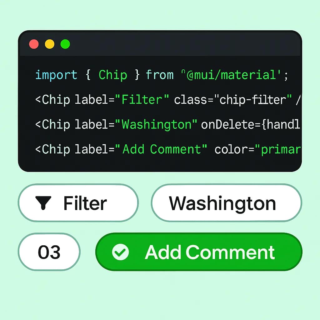
Material-UI provides a robust Chip component with extensive customization options for React applications. The component supports all standard chip types while allowing custom styling that maintains accessibility and usability standards.
Creating custom chip components requires implementing proper keyboard navigation, focus management, and screen reader support. These accessibility features are essential for creating inclusive experiences that work for all users regardless of their interaction method.
Handling chip arrays and dynamic content management involves state management patterns that efficiently update the user interface when chip collections change. This includes adding, removing, and modifying chips based on user interactions or external data changes.
CSS styling approaches for chip components must account for cross-browser compatibility and responsive behavior. Modern CSS features like flexbox and grid layout provide powerful tools for creating chip layouts that adapt to different screen sizes and content lengths.
Accessibility and Usability
Creating accessible chip implementations ensures that all users can effectively interact with your interface regardless of their abilities or assistive technologies. Accessibility considerations must be integrated from the beginning of the design process rather than added as an afterthought.
Screen readers require specific markup and labeling to properly announce chip content and state changes to users. ARIA labels should provide clear descriptions of chip functionality, while ARIA states communicate selection status and other dynamic properties.
Keyboard navigation patterns for chip interaction must follow established conventions that users expect from interactive elements. Tab navigation should move between chip groups logically, while arrow keys enable navigation within chip collections. Space and Enter keys should trigger chip selection or action consistently.
Focus management becomes particularly important in dynamic interfaces where chips appear and disappear based on user actions. The focus should move logically when chips are removed or added, preventing users from losing their place in the interface.
Visual focus indicators must be clearly visible against all background colors and chip states. These indicators help keyboard users understand their current position and available actions. The focus indicator should never be removed or made invisible, as this creates significant barriers for keyboard users.
Voice control and assistive technology support requires implementing proper semantic markup and ensuring that chip labels are descriptive enough for users to identify and interact with specific elements through voice commands.
Testing chip accessibility requires using actual assistive technologies like screen readers and voice control software. Automated accessibility testing tools can identify some issues, but manual testing with real assistive technologies provides the most accurate assessment of user experience quality.
Common Mistakes and How to Avoid Them
Understanding common chip implementation mistakes helps teams avoid usability problems that can significantly impact user experience. These pitfalls often stem from misunderstanding chip behavior patterns or failing to consider the broader interface context.
Mixing single-select and multi-select behaviors within the same chip group creates confusion about how the interface works. Users develop mental models about interface behavior quickly, and inconsistent patterns violate these expectations. Maintain consistent selection behavior within each chip group, clearly distinguishing between single and multiple selection contexts.
Using decorative icons that don’t serve functional purposes adds visual noise without improving usability. Every icon within a chip should communicate specific information about the chip’s content or functionality. If an icon doesn’t help users understand or interact with the chip more effectively, it should be removed.
Insufficient visual contrast between selected and unselected states makes it difficult for users to understand current system state. This problem becomes particularly severe for users with visual impairments or when viewing interfaces in challenging lighting conditions. Test chip visibility in various environments and lighting conditions to ensure consistent readability.
Overcrowding interfaces with too many chip options overwhelms users and defeats the purpose of using chips to reduce cognitive load. Follow the 7±2 rule for cognitive load, limiting visible chip groups to 5-9 options maximum. Use progressive disclosure or scrolling for larger chip sets rather than displaying everything simultaneously.
Inconsistent chip labeling and terminology across the application confuses users who expect similar functionality to be described using similar language. Develop a consistent vocabulary for chip labels and maintain it throughout your interface. This consistency extends to icon usage, color coding, and interaction patterns.
Ignoring mobile touch target requirements creates accessibility barriers and increases user frustration on touch devices. Ensure that all chips meet minimum touch target sizes even when displayed at smaller scales. This requirement is particularly important for dense layouts where multiple chips appear close together.
Advanced Chip Patterns and Customization
Advanced chip implementations unlock additional functionality while maintaining the core benefits of compact, interactive design. These patterns address complex use cases that go beyond basic filtering and selection scenarios.
Creating themed chip variations using Material Theming allows applications to maintain brand consistency while leveraging established usability patterns. Custom color palettes, typography, and spacing can be applied to chips without sacrificing accessibility or user familiarity with chip behavior.
Multi-line chip implementation accommodates content that exceeds standard single-line constraints. These expanded chips might display additional details when selected or provide multiple pieces of information within a single chip container. Careful design is required to maintain scanability while providing detailed information when needed.
Chip grouping strategies for large datasets involve organizing related chips into categories or sections that users can navigate efficiently. This might include collapsible chip groups, progressive disclosure patterns, or search functionality within chip collections.
Integration with search and filtering systems requires coordinating chip state with backend queries and search results. This integration should provide immediate feedback while handling loading states and potential errors gracefully. Users should understand when their chip selections are being processed and when results are available.
Custom delete icons and advanced interaction patterns can enhance chip functionality for specific use cases. This might include drag-and-drop reordering, bulk selection and deletion, or contextual actions that appear when chips are selected or focused.
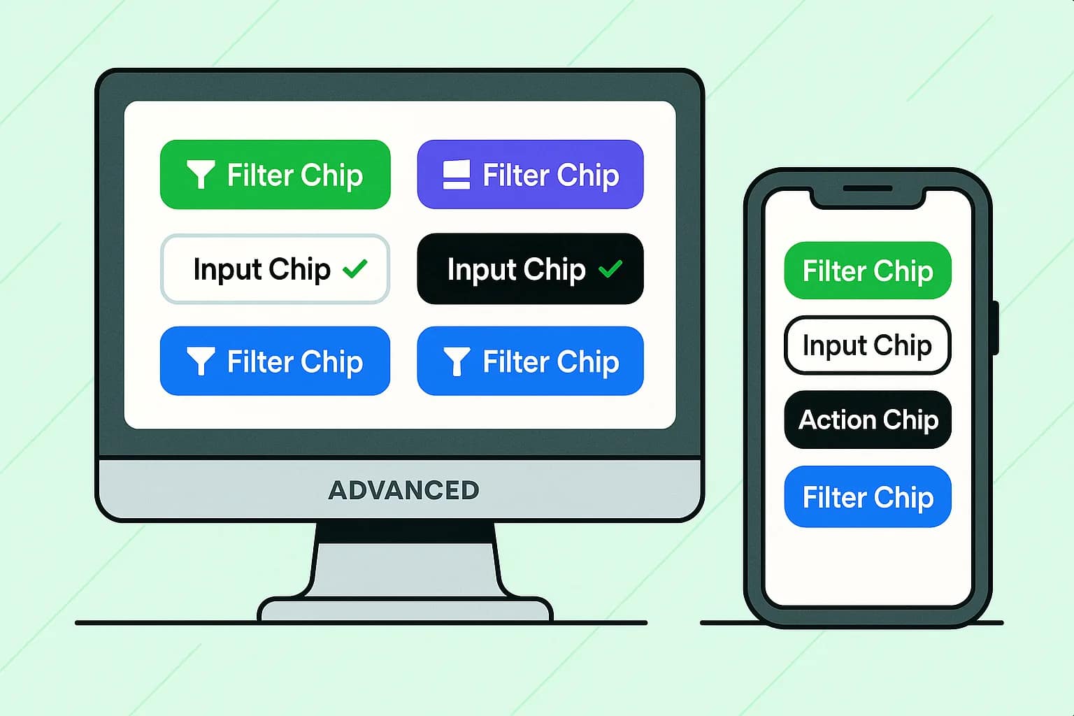
Responsive chip behavior across different screen sizes ensures consistent functionality regardless of device constraints. This includes wrapping chip collections to multiple rows, adjusting chip sizes for different screen densities, and potentially changing chip layouts for extremely constrained displays.
FAQ
What’s the difference between chips, badges, and tags in UX design?
Chips are interactive elements that users can tap, select, or manipulate to filter content or trigger actions. Badges are non-interactive status indicators that display information like notification counts or system states. Tags are typically non-interactive labels used for categorization. The key distinction is that chips specifically refer to interactive UI components that respond to user input, while badges and tags are primarily informational displays.
How many chips should I include in a single row or group?
Follow the 7±2 rule for cognitive load, aiming for 5-9 chips maximum in a visible group. For mobile interfaces, 3-5 chips per row typically work best due to screen width constraints and touch target requirements. When you need to display more options, use progressive disclosure techniques, scrolling, or organize chips into logical categories rather than overwhelming users with too many simultaneous choices.
Can I mix different chip types in the same interface?
Yes, you can use different chip types within the same interface, but maintain clear visual distinction between chip types and ensure consistent behavior within each group. For example, filter chips in one section should all behave as either single-select or multi-select, never mixed. Use visual cues like different colors, shapes, or icons to help users distinguish between chip types and their expected behaviors.
What’s the recommended character limit for chip labels?
Keep chip labels under 20 characters for optimal readability across different screen sizes and languages. Use ellipsis (…) for longer text and provide tooltips, expandable details, or full information in other interface areas when users need complete content. Short, descriptive labels work best because they allow users to quickly scan and understand chip functionality without requiring detailed reading.
How do I ensure my chips work well with screen readers?
Implement proper semantic markup using appropriate HTML elements and ARIA attributes. Provide descriptive labels that communicate chip content and functionality clearly. Use ARIA states to announce selection changes and other dynamic properties. Ensure keyboard navigation works correctly with tab and arrow key support. Most importantly, test your implementation with actual screen reader software like NVDA, JAWS, or VoiceOver to verify the user experience quality.